I actually can tie this all together - watch: I recently took a workshop by Women, Work and Community.
http://www.womenworkandcommunity.org/
This was an informative, quick paced workshop on
Web 2.0 & E-Commerce at UMA. I highly recommend these workshops - they are for free! I had a few minutes to spare prior to the workshop so I went to the Student Center to photograph a sculpture I did in 2004. The
mermaid sculpture, entitled 'Whole', was my solution to an assignment. I took the Sculpture II class in 2004 because the Dept. of Ed felt I needed an additional 3-D course to add
to my BFA in Drawing, to approve my Visual Arts teaching certificate. This assignment involved making a body cast in plaster and incorporating some sort of structure for support. My support structure was an old dining chair.
There is a good story to go with this sculpture... and in the end this piece was juried in to the annual art show and was chosen for a purchase prize. It is on display at UMA.
At the Web 2.0 workshop we discussed branding and brand identity. As a group we analyzed a few websites to critique their 'brand identity'. I learned that the two colors you should NOT use in your branding (logo, avatar, headers, etc.) are
Purple & Orange. I don't mean together. Don't use either one! Purple & orange are supposedly the two most offensive/disliked colors by the general public. What does this say for a major donut company that uses pink & orange in their branding? Anyway, to the left is the avatar I use on Etsy and Ravelry - and I like it!


 We got a lot done on 'this old house' this summer, but we still have one side to go on the clapboarding. There's always next year....


 Yesterday I started to put together this year's school mural. I got to square 151, out of 300. It will take about 10 hours total to complete. This is always an exciting and exhausting process. Wonder what this mural is a painting of? Hint: A teacher stopped by while I was working and I gave her this clue: "The bottom half of this very famous painting is not nearly as recognizable as the top half."


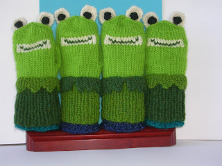
 I like this version of the eyes, they are closer together. I knitted many ears before settling on these. All in all, I'm pretty happy with this design. I'll write up the pattern now, and then look for some test knitters on Ravelry. I am also working on a picture book manuscript. It's a story about a turtle. The prop I am using for my illustrations is in this photo.


